
Color Stories Shaping 2026 and Beyond
The color stories of 2026 offer a perfect range of grounding and whimsical hues, so you’re sure to find the right trend for your 2026 track.
Color speaks before words ever do. It captures attention, sparks emotion, and anchors memories. As we move through 2026, the color landscape reveals four distinct narratives that are reshaping fashion, retail, and branded merch. Each story carries its own energy, offering brands new ways to connect with audiences who crave authenticity, joy, and clarity in equal measure.
Soft Reset: The Power of Pause
The soft palettes of this trend feel like a long exhale, honoring space for simplicity and rest.
The Mood: Clarity | Palette Cleanser | Simplification | Blank Canvas | Soothing
The world has been loud. Soft Reset answers with a whisper.
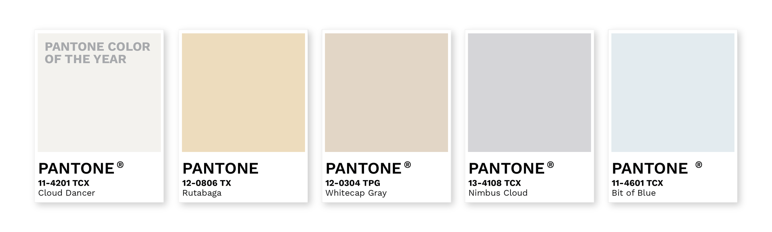
This palette strips away the noise and makes room for breath. Cloud Dancer leads the charge as Pantone's Color of the Year, embodying that rare moment when you finally clear your desk, organize your thoughts, or step into a freshly made bed. These hushed neutrals and barely-there tones create visual calm in a culture that's learned to value intentional simplicity.
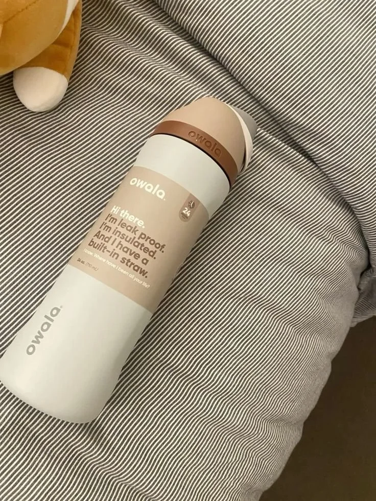
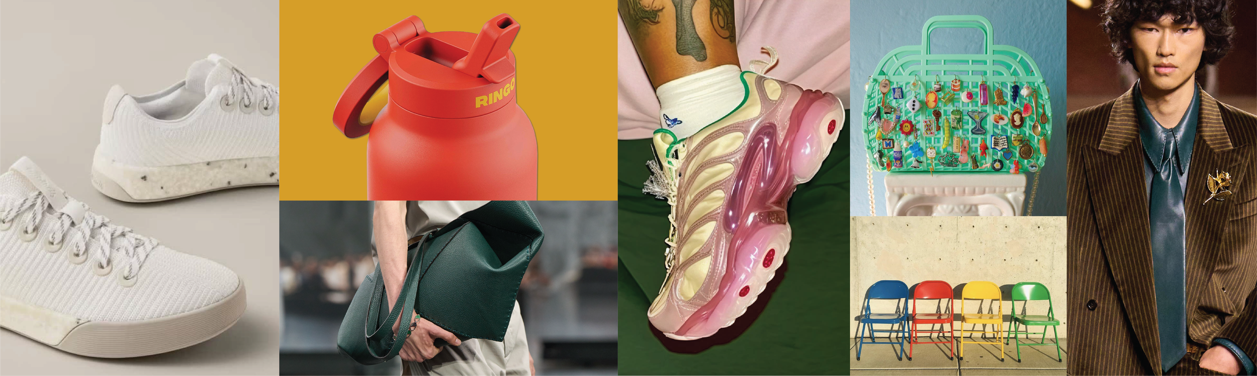
Owala has swapped some of their vibrant color selections for neutrals, showcasing the consumer shift towards relaxing palettes.
Soft Reset feels calm because it isn’t asking to be noticed. The palette functions as a backdrop for life, letting experiences, products, and people take center stage. Think of the satisfying feeling of deleting 1,000 spam emails or the mental clarity that comes with a minimalist space. These colors channel that same energy into tangible form.
Where It Lives: Wellness brands are embracing Soft Reset as their visual language, wrapping self-care products in colors that promise restoration. Apparel companies are leaning into these tones for basics that feel elevated, turning everyday essentials into small luxuries. In branded merch, this palette transforms corporate swag into thoughtful gifts: tote bags, journals, and drinkware that recipients actually want to keep and use.
Why It Works: Consumers are actively seeking less chaos and more intention. Soft Reset delivers exactly that, creating breathing room in oversaturated markets. These colors signal quality, mindfulness, and a return to what matters. When your brand needs to communicate trustworthiness and sophistication without shouting, this is your story.
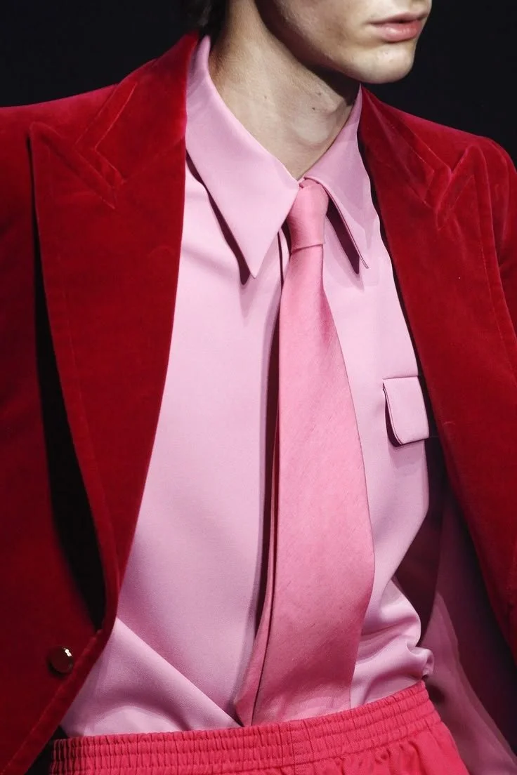
Primary Revival: Grown-Up Playground
These elevated primary colors evoke senses of nostalgia while elevating the brands built for today.
The Mood: Fresh | Muted | Saturated | Playful | Juvenile | Nostalgic
Remember when colors were simple? Red, blue, yellow—the building blocks of every crayon box, every childhood afternoon spent creating something out of nothing.
Primary Revival brings that energy back, but with a knowing wink. These aren't the primaries of kindergarten finger painting. They're sophisticated, slightly softened, and deeply saturated in ways that feel both familiar and fresh. The palette taps into collective nostalgia while maintaining enough polish for adult applications.
What makes this story compelling is its emotional range. The colors feel joyful without being juvenile, playful without sacrificing polish. They reference the uncomplicated happiness of youth while speaking directly to adults who want to reclaim some of that unfiltered optimism. This is color as permission to not take everything so seriously.
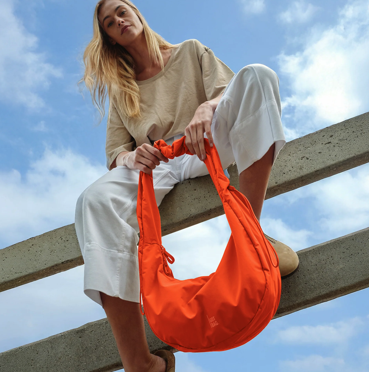
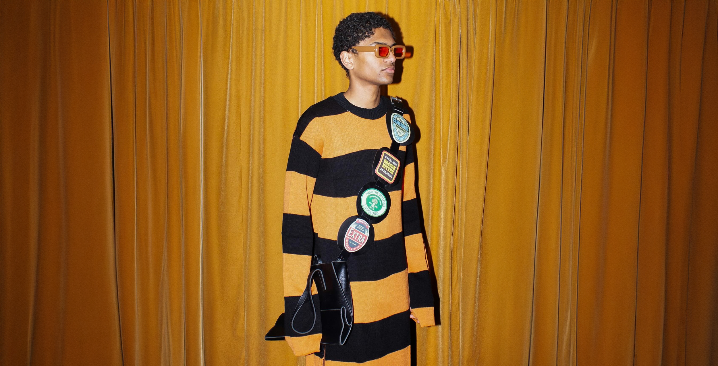
Got Bag has adopted these palettes beautifully, with vibrant hues that elevate any look.
Where It Lives: Retail spaces are using Primary Revival to create environments that feel welcoming and energetic without overwhelming. Fashion brands are deploying these tones in unexpected combinations—a muted coral blazer, saturated blue accessories, sunshine yellow accents that pop against neutral bases. For branded merchandise, this palette transforms ordinary products into conversation starters. A hoodie in the right shade of revival red becomes a statement piece, not just swag.
Why It Works: The current cultural moment craves authenticity and emotional honesty. Primary Revival channels both by acknowledging our collective desire to reconnect with simpler times while staying firmly rooted in the present. These colors say "remember when things felt easier?" without actually being childish. That balance is powerful for brands looking to build genuine connections with audiences who value both nostalgia and sophistication.
Jelly Bright: Sensory Overload (In the Best Way)
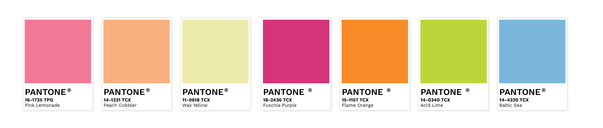
The semi-translucent, bright, youthful hues in this collection offer a refreshing take on nostalgia.
The Mood: Youthful | Nostalgic | Brights | Sensory Feel | Gummy | Jelly | Neons
Close your eyes and think about biting into a gummy bear. That translucent, slightly squishy texture. The way light passes through it. The unnaturally perfect color that somehow makes it more delicious. Now imagine that sensation as a color palette.
Jelly Bright lives in that space where visual and tactile blur together. These are colors you can almost feel: translucent, bouncy, saturated with the kind of artificial vibrancy that defined '90s and early 2000s aesthetics. They glow from within, radiating a playful energy that refuses to be ignored.
The palette taps into a specific kind of nostalgia: the texture-obsessed, sensory-driven trends that defined millennial and Gen Z childhoods. Jelly shoes, gummy candy, neon slap bracelets, those squishy gel pens that made homework bearable. Jelly Bright updates those memories for current audiences who appreciate both the throwback and the forward-thinking applications.
Jelly Brights make the perfect accessories for pops of color and nostalgia that will bring joy to any room or outfit.
Where It Lives: Tech accessories are having a moment with Jelly Bright—phone cases, laptop sleeves, and headphones in these translucent, glowing tones. Fashion is experimenting with jelly textures in bags, shoes, and jewelry that catch light in unexpected ways. Branded merch in this palette stands out on any desk or in any bag. A neon yellow water bottle or gummy-textured notebook delights just as much as it functions.
Why It Works: In a market saturated with minimalism and muted palettes, Jelly Bright offers pure, unapologetic joy. These colors are confidently maximalist, appealing to audiences who've grown tired of playing it safe. They work especially well for brands targeting younger demographics or anyone looking to inject personality and fun into their visual identity. The sensory quality of these tones creates an almost physical response; people want to touch them, use them, show them off.
Deep Luxe: Rich Color with Lasting Impact
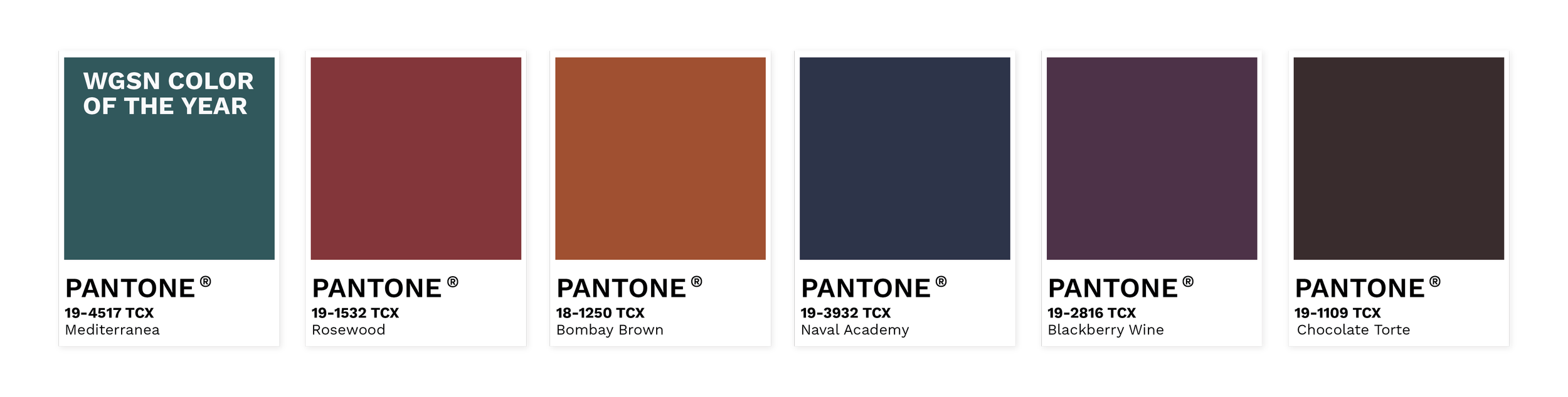
The deep, luxurious palettes in this collection offer rich hues that transcend seasons and keep you feeling grounded.
The Mood: Rich | Transeasonal | Deep | Jewelled | Grounded
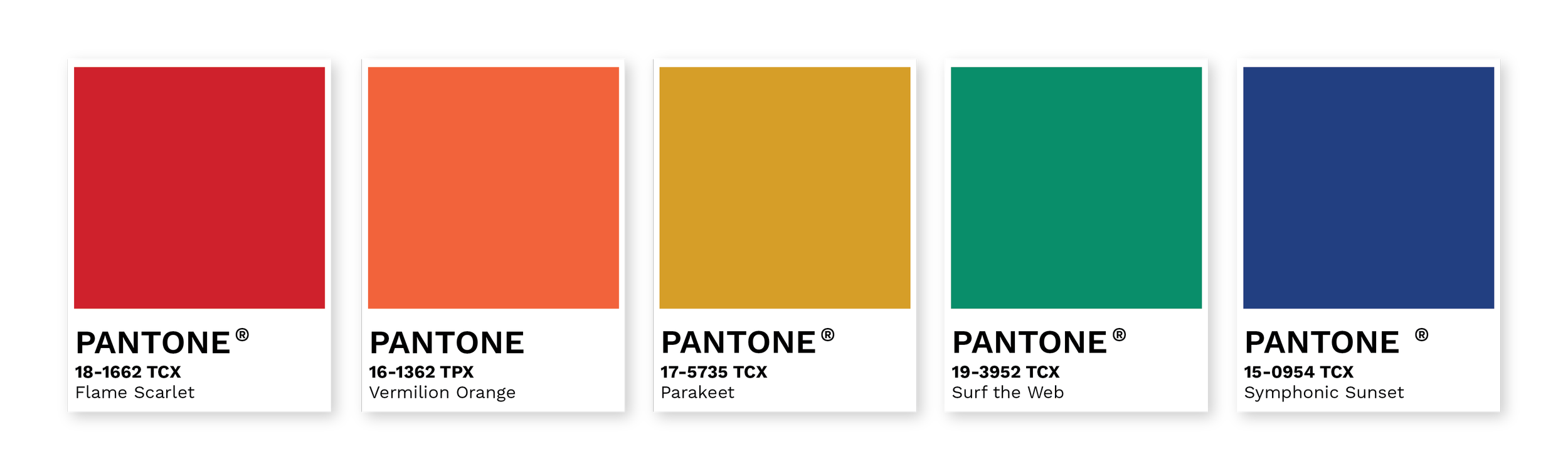
Deep Luxe goes where color has weight. These are tones that feel saturated, dimensional, and intentional. They’re colors that sit in shadow rather than light. Mediterranea anchors the palette with a deep blue-green that recalls water, stone, and patina, while surrounding hues pull from wine, earth, and polished mineral.
This story marks a shift away from surface-level polish and toward something more substantial. Deep Luxe feels collected, not curated. It favors depth over brightness and longevity over novelty, offering a sense of quiet confidence that doesn’t need embellishment.
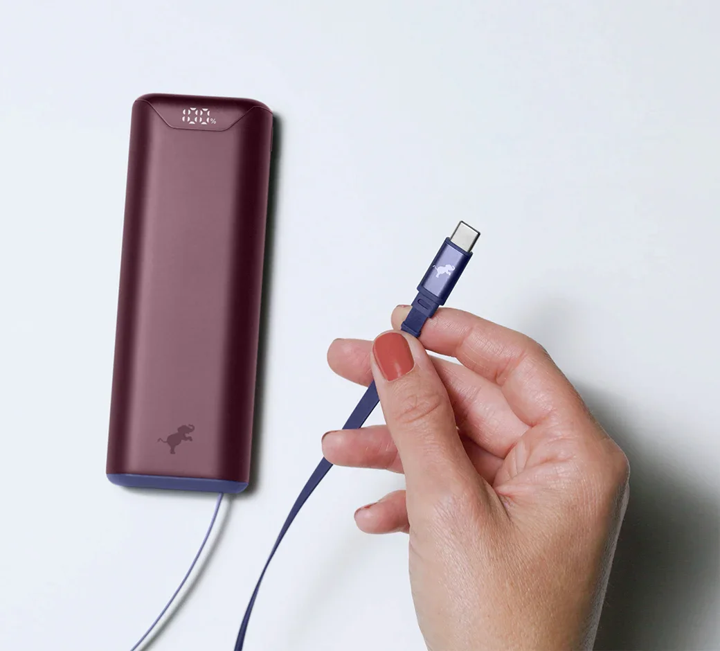
Even tech companies are adopting the Deep Luxe trend, offering more luxurious and engaging colors for everyday items.
Where It Lives:
Deep Luxe shows up in elevated essentials like outerwear, knits, accessories, and interiors designed to feel lasting rather than seasonal. Retail spaces are using these tones to create warmth and intimacy, replacing stark minimalism with environments that invite people to slow down. In branded merchandise, this palette elevates everyday objects into keepsakes: deep green bags, oxblood drinkware, espresso-toned packaging that feels intentional and permanent.
Why It Works:
Consumers are moving toward fewer, better things. Deep Luxe aligns with that mindset by signaling quality, maturity, and trust. These colors age well, resist trend fatigue, and carry emotional weight, making them especially effective for brands looking to communicate value without excess. In a visual culture that often rewards loudness, Deep Luxe stands out by staying grounded.
Four Stories, Infinite Possibilities
Each 2026 Color Story conveys a captivating narrative for your brand to adopt. Pick a theme, or select your favorites from each in your merchandise offerings for 2026.
The beauty of 2026's color landscape is its diversity. Soft Reset, Primary Revival, and Jelly Bright each tell distinct stories, yet they can coexist and even complement each other depending on how they're applied. A brand might use Soft Reset as a foundation, Primary Revival as accent colors, and Jelly Bright for limited edition drops that surprise and delight.
What ties these palettes together is their emotional intelligence. Each responds to genuine cultural desires: the need for calm, the craving for authentic joy, the appetite for sensory experiences that break through the digital noise. Color trends work best when they're rooted in real human needs, and these three stories deliver exactly that.
Whether you're developing a new product line, refreshing your brand identity, or curating merch that people actually want to use, these color stories offer proven pathways to connection. The question isn't which trend to follow, it's which story resonates with your brand's authentic voice and your audience's deepest desires.
Ready to bring these color stories to life? Let's talk about how Whitestone can help you translate trends into tangible results that drive engagement and build lasting brand loyalty.
Looking for more inspiration? Explore our full 2026 Trend Forecast to discover the patterns, materials, and movements shaping the year ahead.
Images courtesy of WGSN